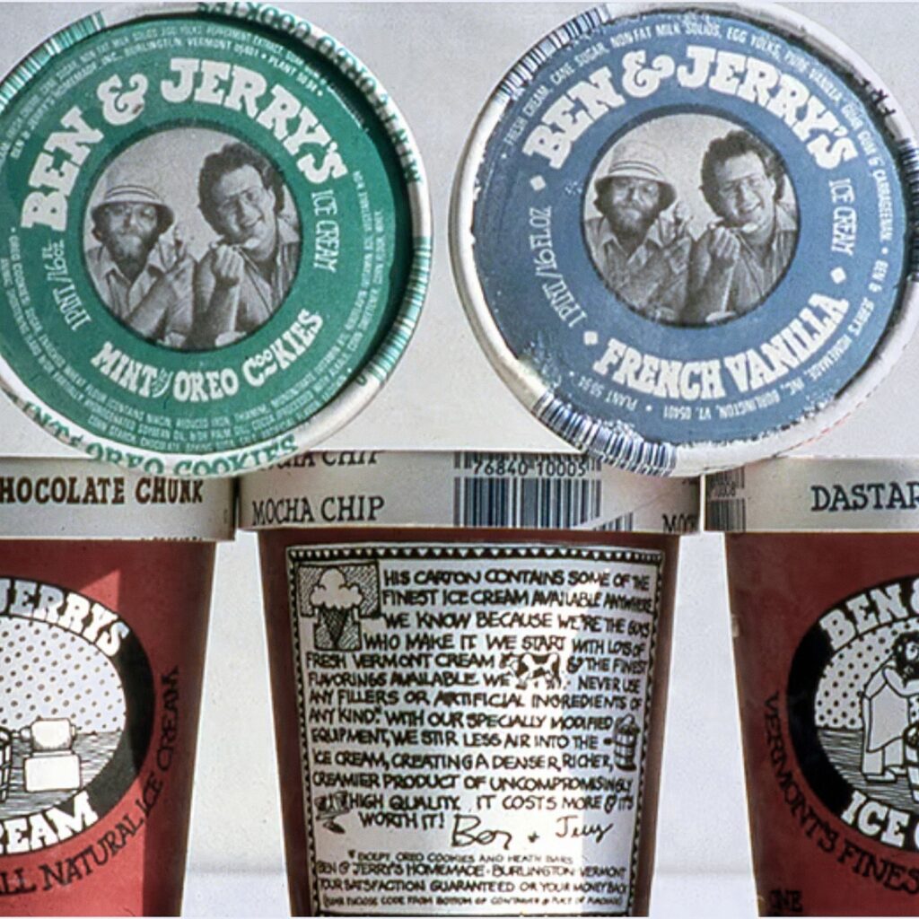
Hand lettering that makes an ice cream pint look homemade
Most grocery-store packaging wore polished type. Ben & Jerry’s first pints, in 1980, wore chunky, uneven letters that look drawn by hand.
The branding lesson
When Ben & Jerry’s started packing pints for local grocery stores in February 1980, the carton set the brand name and flavor in chunky, uneven letterforms that look drawn by hand. The look comes from the brand’s early identity by Vermont designer Lyn Severance, which Ben Cohen once described as “this fine line of childlike sophistication; chic funk.”
Read the whole lesson, free.
Create a free account to open the takeaway and the psych of why it works on every card. No card needed.
The psych of why it works
Free with an accountSteal the thinking
Members onlyCredits and sources
- Brand
- Ben & Jerry's · Visit Ben & Jerry's
- Image
- People's Graphic Design Archive
- Industry
- Food and drink