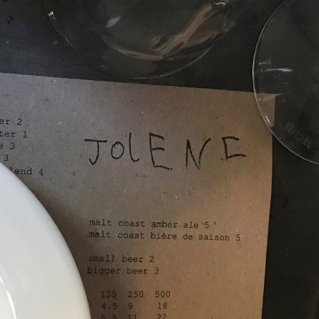
A bakery’s wordmark lettered in a six-year-old’s hand
Jolene’s owner wanted a logo that looked “naive, almost childish.” The draft he got was drawn by designer Frith Kerr’s six-year-old son.
The branding lesson
At Jolene, a bakery and restaurant in north London, the name is written in the hand of designer Frith Kerr’s then six-year-old son. Owner Jeremie Cometto-Lingenheim had asked for a logo that would “look naive, almost childish,” for food rooted in farming that preserves “the soil for future generations.” The lettering runs across the daily menu, totes, carrier bags and curtains.
Read the whole lesson, free.
Create a free account to open the takeaway and the psych of why it works on every card. No card needed.
The psych of why it works
Free with an accountSteal the thinking
Members onlyCredits and sources
- Brand
- Jolene · Visit Jolene
- Image
- Studio Frith via Dezeen
- Industry
- Hospitality