A pizzeria logo that stretches like melted mozzarella
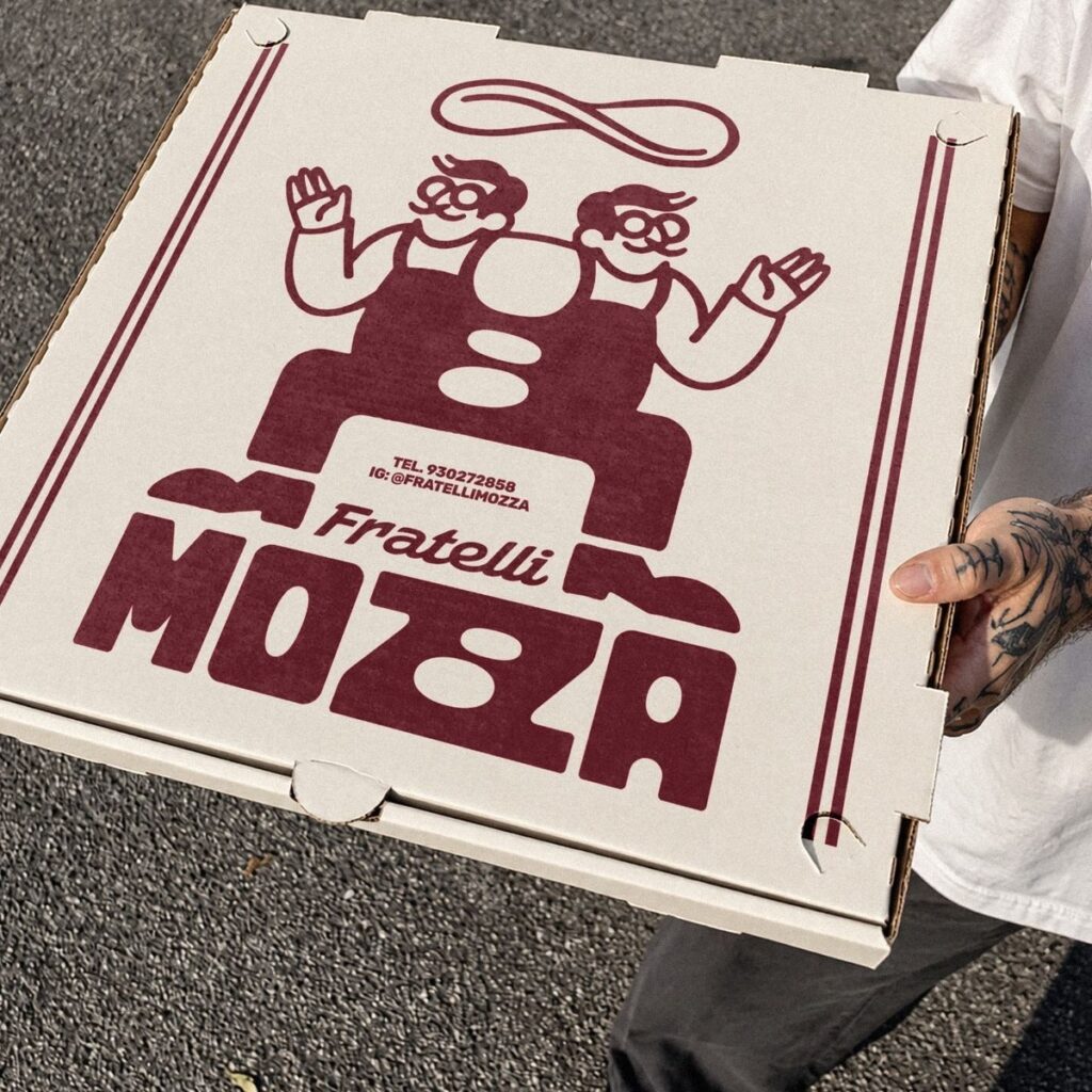
Most pizzeria logos borrow a chef or a flag. Fratelli Mozza’s stretches the double Z in its name into a looping strand of mozzarella.
What they did
Fratelli Mozza’s identity, designed by DONE., is built on how mozzarella moves when it melts. The double Z in MOZZA is a stretched, looping strand, and the box illustration ties two brothers together with a cheese pull. Boxes, posters and stacked takeaway all use one deep red on cream. Over time, this builds brand recognition for Fratelli Mozza.
Let’s look at why this works
Create a free account to read this lesson’s takeaway and the psychology behind it. No payment card needed.
The psych of why it works
Free with an accountSteal the thinking
Members onlyThe original
Members onlyAll 12 pieces in full, with its full text. Kept whole, uncropped, for Brand Builders to use as a reference.
Credits and sources
- Brand
- Fratelli Mozza · Visit Fratelli Mozza
- Image
- Fratelli Mozza (identity by DONE.), via Bounty Hunters
- Found via
- Bounty Hunters
- Industry
- Hospitality